Angular Column Filters
As of 3.4, the Angular eg-grid has been enhanced by adding a new per-column filtering widget with many new features. This widget allows column headers as well as the filter bar to remain visible, or frozen, at the top of the screen if one scrolls down the grid.

Various column filters can be used in combination with one another to provide a highly specific list.
For text-based columns, the filtering provided in this widget is case-sensitive by default. Future development could add a trigram index on selected columns as needed in order to permit case-insensitive filtering on those columns. Fully case-insensitive filtering can result in speed issues, particularly where large database tables are involved, and it is advised that future developers balance the needs of case-insensitive search with potential performance concerns.
Each column in the filter bar has an Operator Button and an Entry Box. The Operator Button is shown on the left in the image below, and the Entry Box on the right.

If you select the Operator Button you will see that each column also has an Apply Filter and a Clear Filter button.
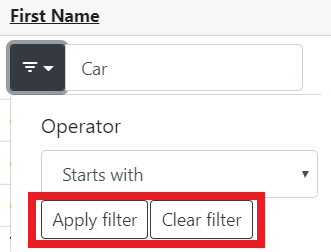
To apply a filter, enter text, date, or numeric value in the Entry Box then press Enter or select Apply Filter. The type of entry will depend on which column type is being used. Most columns use a default operator of Is exactly. For columns using a combobox, selector, or Boolean value, the filter will be applied upon selection of a value and you do not need to press Enter or select Apply Filter.
Operator options are different depending on the column type.
The example below shows the entry box with a value of “Car” and the Operator selected is Starts with.
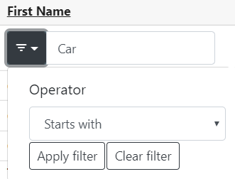
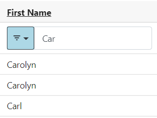
The results of this filter are shown below. A column with a filter in place will show the Operator Button styled blue.
Columns which use a text type have operators for:
-
Is exactly
-
Is not
-
Contains
-
Does not contain
-
Starts with
-
Ends with
-
Exists
-
Does not exist
-
Is less than
-
Is greater than
-
Is less than or equal to
-
Is greater than or equal to
Columns which use a date or numeric type have operators for:
-
Is exactly
-
Is not
-
Exists
-
Does not exist
-
Is less than
-
Is greater than
-
Is less than or equal to
-
Is greater than or equal to
For both of the above operator sets, Exists indicates a value that is not NULL and Does not exist indicates a value that is NULL.
Date columns also have a Between operator.
Columns which are Boolean have operators for:
-
Any
-
True
-
False
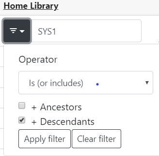
Columns which use an Organizational Unit combobox have operators for Is (or includes) and Is not (or excludes). This filter also includes the ability to select Organizational Unit ancestors and/or descendants as part of the filter. The combobox will accept typeahead entry and also will show an Organization Unit dropdown if you click in the entry box.
| Be aware that when using Operator types such as Contains, Starts with, or Ends with there is a risk of invoking a full table scan and thus the possibility of a noticeable slowness in retrieval. This risk is less likely for Starts with, as many text columns already have database indexes that lend themselves to left-anchored searches. |
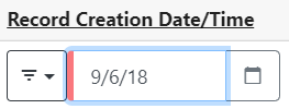
As of this writing, columns with a date data type will only accept typed entry in YYYY-MM-DD format and do not honor the date.format Organizational Unit Setting. This is a known bug. If an invalid date is entered into the Entry Box, the box will have red styling on the left to indicate this as shown in the image below.
To clear a filter, select the Clear Filter button. You may also delete the value in the entry box and press Enter if in a text column — other columns do not require Enter, as noted above.
There is also a Remove Filters button available which will remove all currently applied filters in the grid.

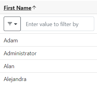
Clicking a column header will sort the column by ascending value, and show an up arrow in the column header. Clicking the header a second time will sort by descending value, and show a down arrow in the column header. A column sorted ascending is shown below.
As part of this project, several improvements were made to existing Angular widgets to support the grid filtering feature:
-
The date selector now has better visual styling.
-
The date selector now supports hitting the enter key to enable an action once a date has been entered.
-
The date selector now highlights when an incorrectly-formatted date has been entered by the user.
-
The date selector and org unit selector widgets now offer methods for code to readily reset their states and fetch the current entered value.
-
The patron date of birth field could be incorrectly displayed by the Angular client; this is now fixed.