Angular Grids
Grids in the Angular framework offer enhanced functionality in column configuration, sorting, and filtering. This page gives an overview of the various capabilities within Angular grids across the staff client.
Column Configuration
You can manage the columns that display and their order by clicking on the gear icon and choosing Manage Columns. Along with selecting which data you would like to display, as you do in other grids, you can also set how you would like the text to align within the column and set the width of characters.
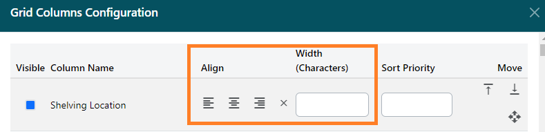
To change the order the columns display:
-
Select the up or down arrows to move the column to the top or bottom of the display. Or you can click and hold the mouse down and drag and drop.
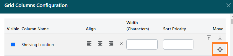
-
Click Move Visible Columns to the Top to aggregate all visible columns.
-
Click Save.
You can also change the order and the width the columns display directly on the grid:
-
To change the order, hover your mouse over the column name you would like to move until you see a hand icon. Click and hold down as you drag the column to where you would like it to appear in the grid and release.
-
To change the width, hover your mouse to the right-hand edge of the column. A resize icon will appear. Click to hold down and drag to the left or right to resize.
Sorting Columns
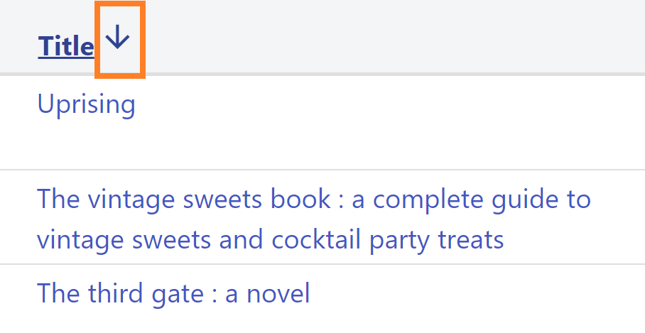
Column names that are bold and underlined indicate they can be sorted in ascending or descending order. To sort, hover your mouse over the title until you see a pointer icon. An up or down arrow will appear next to the column name to indicate whether the results are ascending or descending.
Filtering Columns
If columns can be filtered, a funnel icon will appear under the column name.
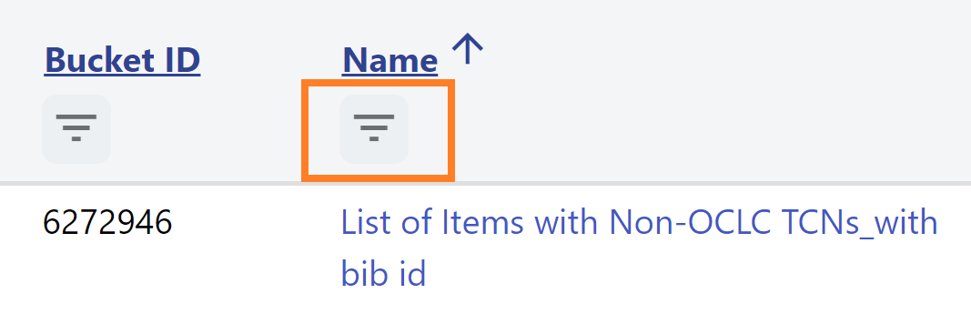
To filter a column:
-
Click the icon to open the filter window.
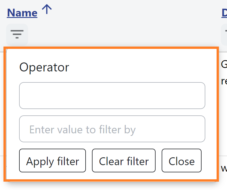
-
Click in the Operator field to select the condition from the dropdown menu, for example, Contains.
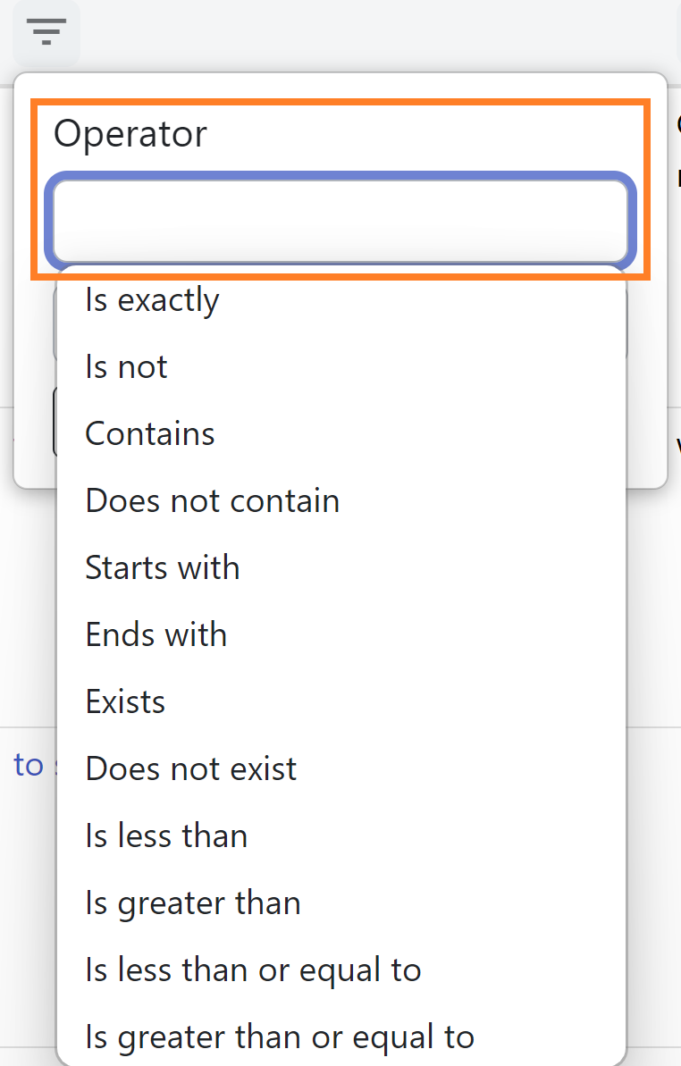
-
Input the value to filter by and click Apply filter.
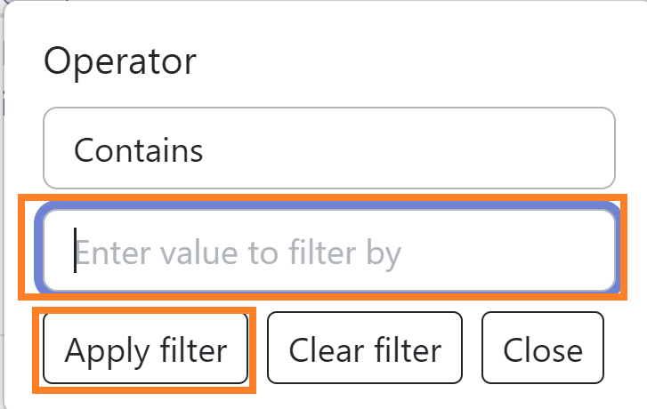
-
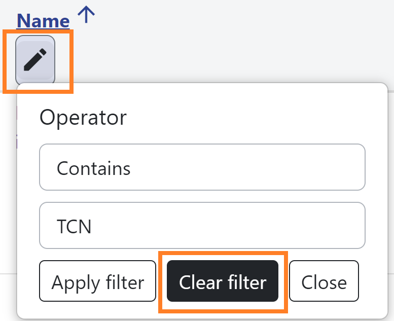
Once a filter is applied, a pencil icon will appear instead of the funnel.
-
To edit a filter, click the pencil button, make any changes, and click Apply filter.
To clear the filter, click the pencil icon and click Clear filter.
Columns which use a text type have operators for:
-
Is exactly
-
Is not
-
Contains
-
Does not contain
-
Starts with
-
Ends with
-
Exists
-
Does not exist
-
Is less than
-
Is greater than
-
Is less than or equal to
-
Is greater than or equal to
Columns which use a date or numeric type have operators for:
-
Is exactly
-
Is not
-
Exists
-
Does not exist
-
Is less than
-
Is greater than
-
Is less than or equal to
-
Is greater than or equal to
For both of the above operator sets, Exists indicates a value that is not null, and Does not exist indicates a value that is null.
Date columns also have a Between operator.
Boolean columns have operators for:
-
Any
-
True
-
False
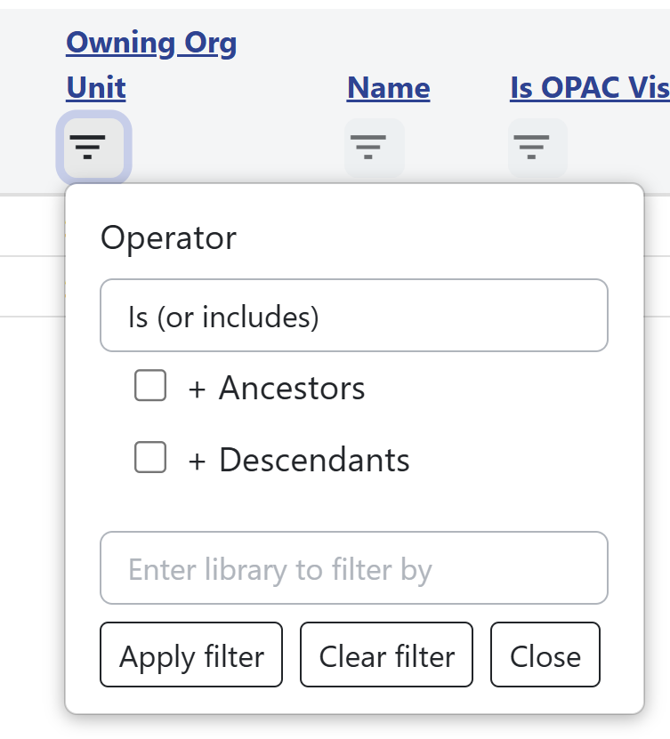
Columns which use an Organizational Unit combobox have operators for Is (or includes) and Is not (or excludes). This filter also includes the ability to select Organizational Unit ancestors and/or descendants as part of the filter. The combobox will accept typeahead entry and also will show an Organizational Unit dropdown if you click in the entry box.
| Be aware that when using Operator types such as Contains, Starts with, or Ends with, there is a risk of invoking a full table scan and thus the possibility of a noticeable slowness in retrieval. This risk is less likely for Starts with, as many text columns already have database indexes that lend themselves to left-anchored searches. |
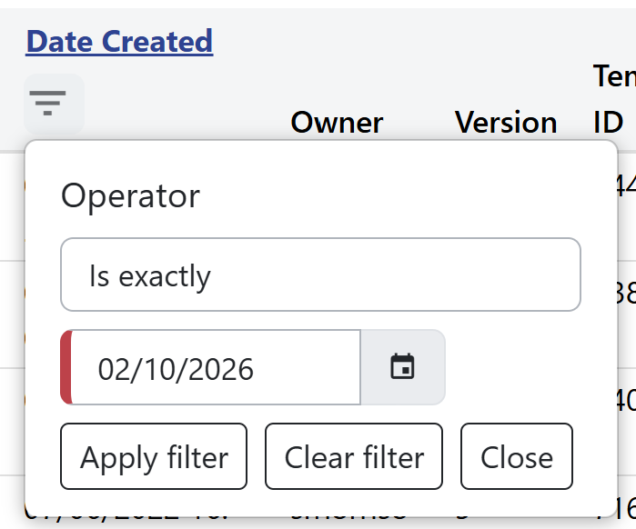
As of this writing, columns with a date data type will only accept typed entries in YYYY-MM-DD format and do not honor the date.format Library Setting. This is a known bug. If an invalid date is entered into the Entry Box, the box will have red styling on the left to indicate this as shown in the image below.
Managing Actions Menu
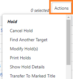
In Angular grids, there is the ability to control which options display in the Actions menu.
To add or remove fields:
-
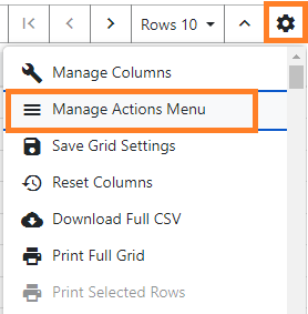
Click the gear icon and select Manage Actions Menu.
-
Select or deselect the actions you would like to display or hide, and then click Close.
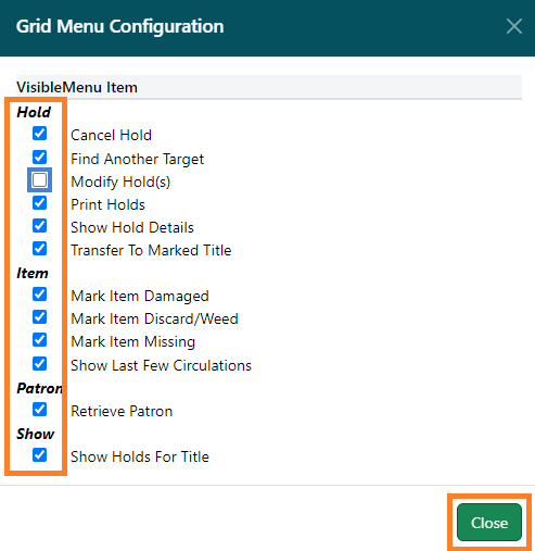
Those changes will now be reflected in the actions menu.
Downloading or Printing Results
From a grid, staff can choose to Download Full CSV, Print Full Grid, and Print Selected Rows, available from the dropdown arrow or gear icon in the function bar. (If there are no results in the grid, these options will be disabled.)

Download Full CSV will download all of the records in the grid regardless of whether or not all of the records are currently visible. For example, if you complete a patron search and retrieve 65 patrons but have your Rows number set to 25, you will only see 25 patrons per page. Clicking Download Full CSV will download all 65 patron records to a CSV file. When the CSV file downloads, it will display data for the columns you have visible.
Likewise, the option for Print Full Grid will also print the visible columns for all of the retrieved records even if they span multiple pages.
To print specific rows:
-
From the grid, select the rows you would like to print.
-
Click the arrow or gear icon at the top right of the grid, and click Print Selected Rows.